Party Together
The election may be done and dusted, and a new Parliament sworn in, but the post mortems will continue in many political circles. We now have detailed voting records from every booth in the country, and while some aspects of booth data are problematic (see the technical notes below for some provisos), it’s the finest level of electoral data we have, and looking at how each booth voted might reveal some interesting relationships. Can it also help us answer some of those burning questions, such as: did some parties “steal” votes from others? Is the Green Party just for urban liberals? Is Wellington in a bubble of its own?
There’s a huge amount of data, and one of the first tools a data visualiser often employs to explore a big dataset is a scatterplot matrix. This plots every variable against every other one, and where there’s a strong relationship this stands out as a distinct line or cluster rather than an amorphous blob. The matrix below shows a scatter plot for each pair of parties, charting the proportion of the vote that they each received, with a tiny dot for each one of over 5000 booths. I’ve also coloured the booths according to some broad electorate categories (Wellington, other urban, rural, and Māori), and the diagonal shows histograms of each party’s vote by booth, broken down by these categories. What does the data show us?
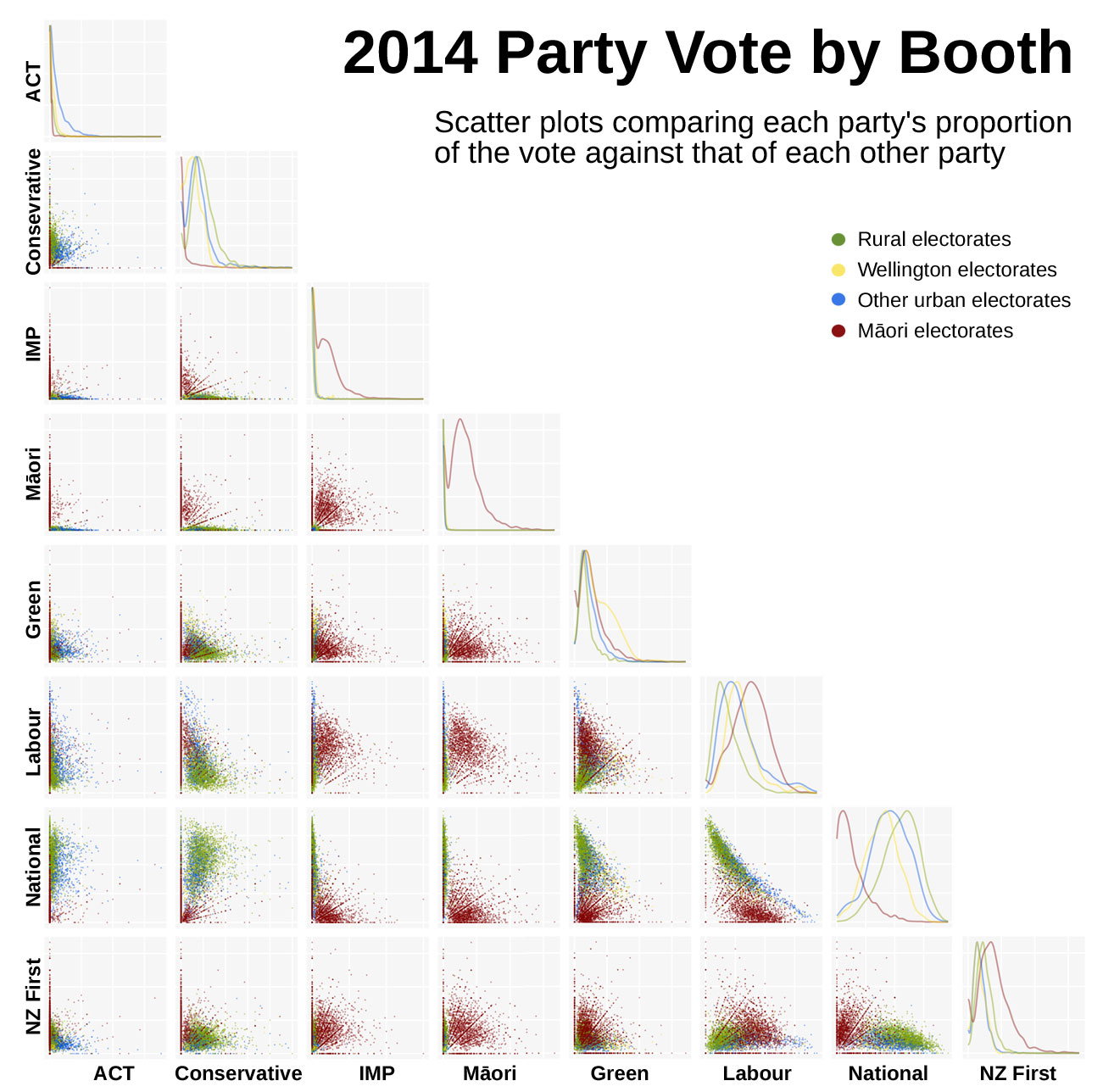
You can click on the chart for a larger version, but even at this scale certain things stand out. There’s not a lot of positive correlation between pairs of parties, except some weak ones such as between National and the Conservatives and Labour and Internet Mana. There’s a negative correlation between National and Labour, as one might expect. The Māori electorates often stand out, partly because there are a lot of applicable booths, but also because of some strong clustering. Some of the smaller parties, such as ACT, Māori, Internet Mana and Conservative, show intense polarising effects: booths cluster along the axes in an L shape, showing that a lot of booths had little or no votes for one of those but relatively high votes for the other. It might be just my choice of colours, but Wellington doesn’t stand out as much as I had been led to expect.
After the break, let’s zoom in to some of the more significant comparisons.
Here’s Labour vs National. The Māori electorates are almost entirely separate, with very few booths voting strongly National, even where Labour support is weak, and many booths showing no National votes at all in Māori electorates. For the general electorates, not only is there a very marked negative correlation, but there’s a clear gradient between National-dominated rural electorates and urban Labour strongholds.
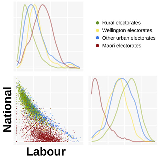
Wellington doesn’t show much clustering on the scatterplot, and on the histograms it looks to be only slightly more Labour-leaning than other urban places. The histogram axes can be a bit confusing at first: they show the degree of a party’s support along the x axis, with the y axis showing the proportion of booths that voted that strongly for that party. Labour’s party histogram is at top left, showing rural electorates skew towards low Labour votes, followed by urban, Wellington and Māori electorates. National support (bottom right) is the opposite, as one would expect, but with an even more distinct difference in Māori vote.
A subtle point is that while Wellington’s Labour peak is slightly higher, there are fewer booths leaning strongly Labour than in other cities, and there are also fewer strong National booths in the Wellington region. I suspect a lot of the supposed distinctiveness of the “beltway” only applies to a small part of greater Wellington, but that will have to wait for another visualisation. In the meantime, let’s look at Labour compared to the Green and Māori parties.
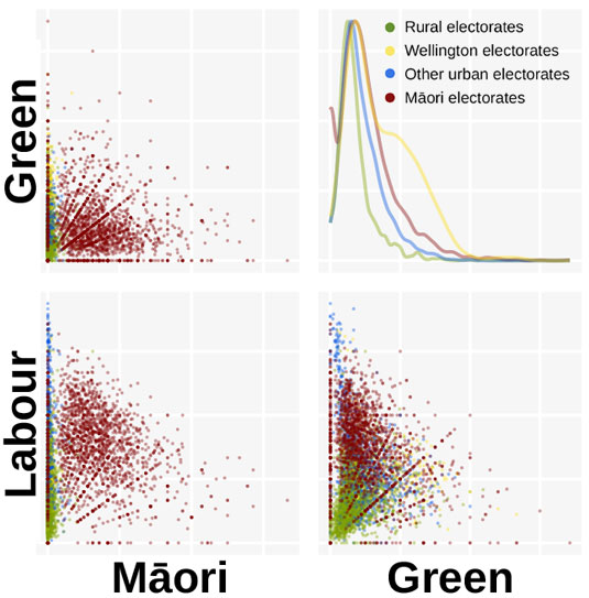
Now Wellington stands out! While most greater Wellington booths still have a low Green vote, their support very distinctly bulges out in Wellington. You can just make out a golden cluster of Wellington booths on the Green vs Labour chart, and it’s centred close to where the Labour vote peaks. There’s an apparent clustering of strongly Labour urban places that get little support for the Māori and Green parties, but there are little yellow Wellington dots spread throughout, from high Green/low Labour (what’s the bet that’s the Aro Valley?) to low Green/high Labour. Maybe the latter are those mythical “traditional working class suburbs”, but then again some of the highest Green votes came from the Māori electorates.
This scatterplot matrix has done what I hoped it would: answer a few questions, but raise even more. I’ll try some geographical analysis soon, once I’ve got latitude and longitude data for the booths.
Technical notes
The booth data comes from the Electoral Commission’s final “party votes recorded at each voting place” page. I use the term “booth” rather than the official “voting place”, since each voting place (church, community hall etc) has ballot boxes for several electorates. Each of these is recorded separately in the data, so that those who vote at Aro Valley Community Centre and are registered in the Wellington Central electorate are counted separately from those who vote there but are registered in Rongotai, for example.
Using booth locations as a proxy for a finer geographic grain of community than electorates is problematic, largely for the above reason. People don’t always vote at the nearest polling place to their home: they could vote while out shopping, on their way to work, or while taking their kids to Saturday sports. This spread could be even more pronounced with early voting. Nevertheless, many booths have shown consistent patterns over time, and they seem to correlate with demographic patterns within diverse electorates. For the purposes of this analysis, each voting place/electorate combination represents a group of voters with certain geographic similarities of home and habit, so I thought that I’d keep these as separate data points.
Some booths have very few voters, and you can see strong diagonal lines in some of the scatter plots where there’s a simple integer ratio between votes for one party and another (e.g. 1 Green vote and 2 Labour votes, or 2 Green votes and 4 Labour votes). Where these lines are very visible, this would suggest very low voter numbers (either a booth serving a small population, or a party with little support), and some caution would be wise.
Electorates that cover a wide geographical area, such as rural and Māori electorates, tend to have a lot of booths, so they show up strongly on the plots. Many of these would represent very few votes, so they can give a skewed perception of overall voter numbers. I might vary the size or opacity of the dots according to total votes in future versions, but for now don’t let the number of dots sway you too much: it’s more about distribution.
I coloured the booths based upon the electorate, rather than the physical location of the voting place. I counted Wellington Central, Rongotai, Ōhāriu, Hutt South, Rimutaka and Mana as “Wellington” electorates, but the urban/rural distinction was fairly arbitrary, based upon population density.
I acquired and processed this data with mostly open source tools. Python downloaded and parsed the CSV files, which then loaded them into PostgreSQL for storage and processing. I used R/RStudio to carry out statistical processing and create the charts, using the ggplot2 and GGAlly packages, then exported them as SVG. The SVG was massaged with Inkscape and Python, and finally tidied up with a bit of Photoshop.