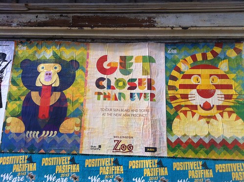
Signs of the time – advertising we like
So many surfaces in Wellington are crammed with posters trying to sell us something, so we thought it might be nice to look at some of the advertising that actually looks good. This week, our favourite piece of advertising are these posters from Wellington Zoo.
 These absolutely gorgeous animals (there’s a red panda in the series too) are by Argentinian illustrator Christian Montenegro and the campaign was put together by Saatchi & Saatchi. Hurray for such a colourful and playful design! In fact, the zoo tells us that the posters are so popular that they’re actually giving them away to visitors, so now would be a really good time to visit, if our posts about close encounters hadn’t already convinced you (EDIT: they say on Facebook “From now until the end of the holidays (or when we run out, whichever comes first!) we are giving away A2 versions of these posters to Zoo visitors so make sure you pop in to see us soon” – just to clarify).
Okay, with every best there has to be a worst, and I think this offering to cruise ship passengers to really experience some Wellington culture speaks for itself: 
What signs/campaigns have you seen around that you love or hate? Let us know – leave us pictures or links in the comments.
