The Mighty Booth
After every election there are geographical analyses of voting patterns, inevitably followed by suggestions that certain regions should secede and form their own country. Such analyses are often at electorate level, but there’s a lot of fine detail below that, and a cell of socialist insurgents might live just around the corner from an enclave of conservative curmudgeons. So I made the following map of Wellington voting tendencies at a booth-by-booth level.
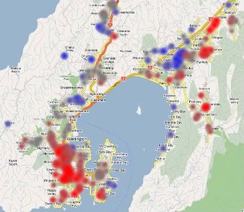
For analysis, explanations, notes on methodology and a whizzy interactive Google Maps mashup of the whole region, read the full story.
 Each blob represents a polling place, and the colour represents the proportion that voted for either left wing (shades of red) or right wing (shades of blue) parties. The full Google Map allows you to zoom in and see the full detail, but you should be aware of a few limitations. First, the blobs are displaced slightly to the north of the actual location, though it gets more accurate as you zoom in (this is due to a “feature” of the Google My Maps custom icons, which offsets the images). Secondly, some of the locations are fairly approximate (since I had to manually place them on the map, and not all had full addresses), though given that voters don’t always vote in their immediate neighbourhood that shouldn’t be too much of a problem. Finally, My Maps only allows a certain number of markers on a single map, so the booths in the far north (e.g. Kapiti) and northeast (e.g. Upper Hutt) of the region are on a separate page.
I downloaded the detailed data from the offical Elections website, then aggregated the votes by polling place. I only looked at party votes in general electorates, and to produce a simple “left-right index” I added the votes up into two blocs, based upon pre-election suggestions of possible coalitions:
Blue bloc = National + Act + United Future
Red bloc = Labour + Green + Progressive
I decided to omit NZF and the Maori Party, mostly because they were not explicitly going to coalesce with the main parties, and all the other minor parties because they didn’t reach the threshold. Then the formula for the percentage calculation was:
Leftiness = Red / (Red + Blue)
In other words, of those voting for the two main likely coalitions, what percentage voted for centre left rather than centre right?
It certainly seems that the Wellington CBD, Aro Valley and inner suburbs voted left, but it’s not all about hippies and the trendy urban liberal elite. The traditional Labour heartland of working class, Maori and immigrant neighbourhoods also stayed staunch, with several booths in Cannons Creek voting for the left by over 90%. The affluent neighbourhoods (Oriental Bay, Khandallah and Seatoun) kept to their blue-blood roots, but there’s also plenty of blue in the Hutt Valley and parts of Tawa: is that the “Joe the Plumber” vote? The only booth to vote more than 75% for the right was in Whitby.
So, what happened at your polling booth?
I take some satisfaction in correlating my own leafletting with the concentration of red-coloured booths. Perhaps though I should have been working the blue more…?
I found this very interesting. Wellington is the most “red” city in the country and the most educated. I think there is a link.
Tom, did you see this? http://www.stuff.co.nz//blogs/showmethemoney/2008/11/15/just-in-case-you-wondered-which-way-wellington-voted/
Ha! According to various right-wingers ‘educated’ = ‘indoctrinated’.
Heaven forbid that the people drawn to the public service are people who actualy want to serve the public by voting for the greater good!
nice work Tom.