Shape of the Suburbs
Last weekend a friend asked on Twitter whether anyone had made a New Zealand equivalent of this poster of London boroughs, which took the outlines of the boroughs out of context by arranging them alphabetically while keeping them to the same scale. This revealed both the weirdness of some of the shapes, and the striking contrast in scale between the largest and smallest ones.
It turns out you can’t do this for New Zealand in general, since in most cities suburbs don’t have official boundaries. But Wellington is different! So I downloaded the suburb boundaries from Koordinates, and with a little help from R, ggplot2 and sf, created the following:
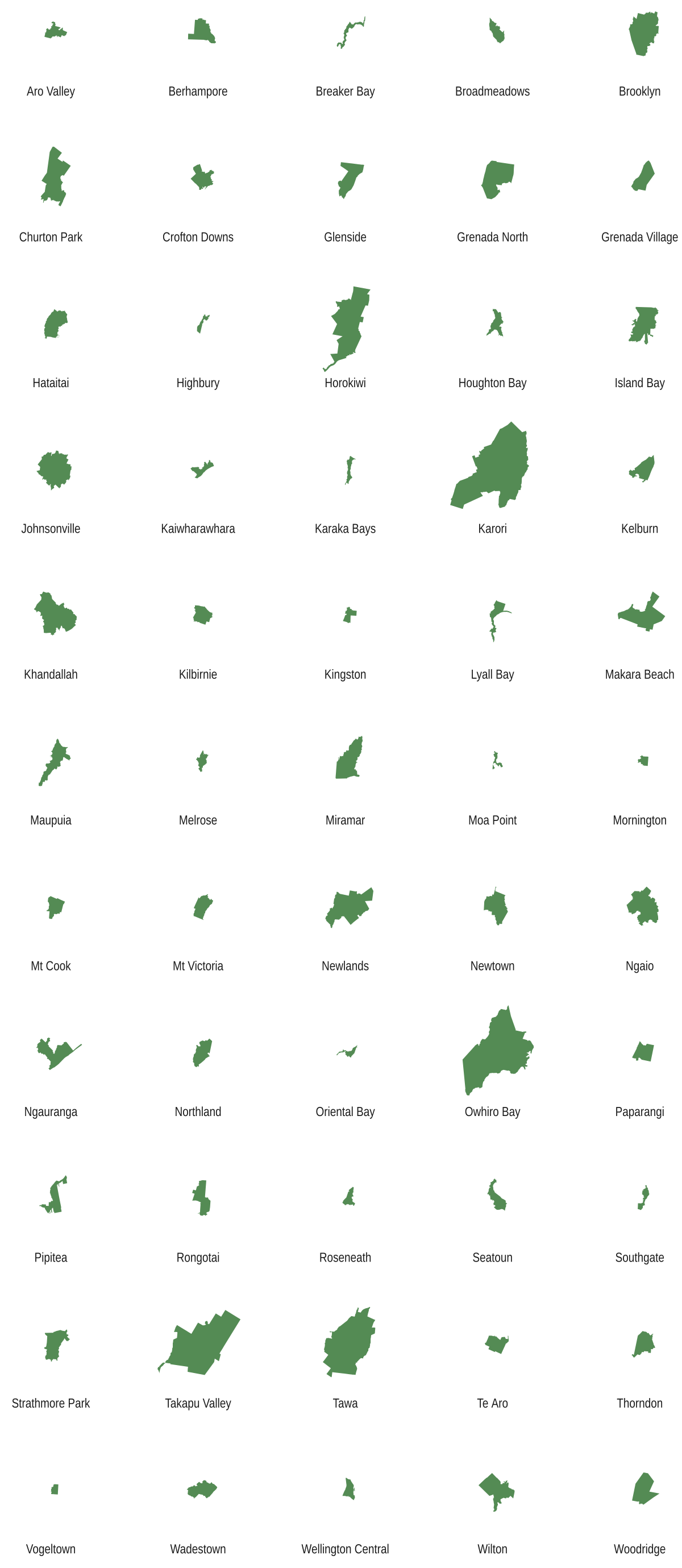
It’s a bit hard to read at that scale, but clicking it will bring up a much larger version. For space and layout reasons, I omitted the purely rural Makara and Ōhāriu, but I kept in a few other official suburb shapes that are much bigger than the actual suburbs due to the inclusion of large rural areas (Owhiro Bay, I’m looking at you).
As well as the vast scale differences (such as between dinky Vogeltown and sprawling Tawa), this provoked much discussion about the oddity of the shapes. Coastlines played a big part, of course, plus old borough boundaries, Mein Smith’s urban grid, rural property edges, and the public consultation process that led to these “official” definitions (no doubt including arguments often fueled by snobbery and property-value panic).
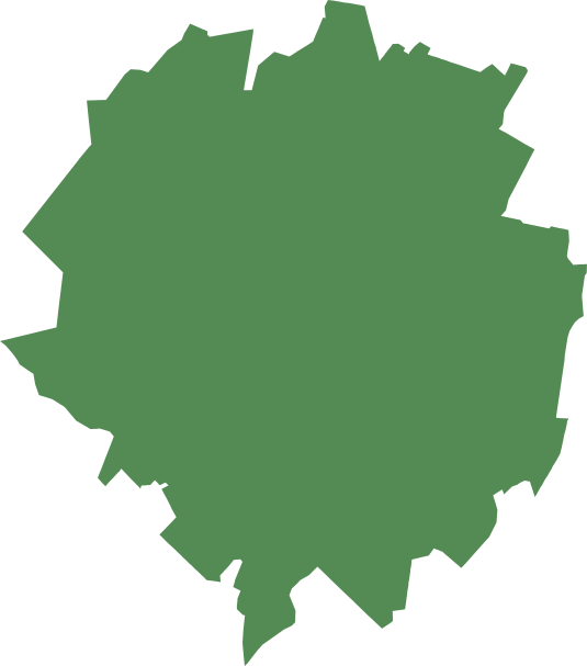
Of the resulting shapes, people on Twitter had no shortage of snarky comments. Johnsonville came in for particular ridicule, variously described as a virus, a tumbleweed and “a dropped bird shit” (harsh, but accurate, according to the Johnsonvillian who proposed that one). Here’s a larger version:
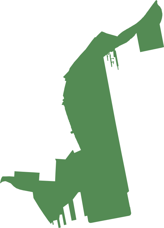
Pipitea reminded someone of a saxophone (“the Kenny G of Wellington suburbs”). When zoomed in, it becomes a particularly hairy saxophone, due to all those wharves:
Seatoun, perhaps appropriately, looks like a Kraken’s tentacle:
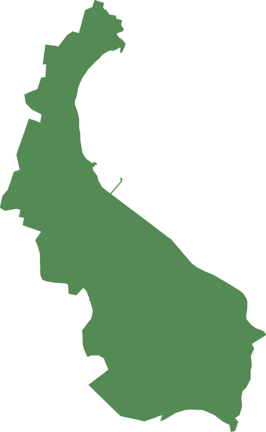
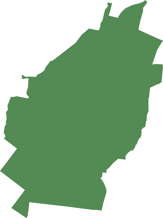
Houghton Bay “looks like it’s legging it”, while Southgate resembles a toeless footprint, and Crofton Downs was described as a Turkey. I also think that Tawa looks a bit like a leaf, though disappointingly not a tawa leaf:
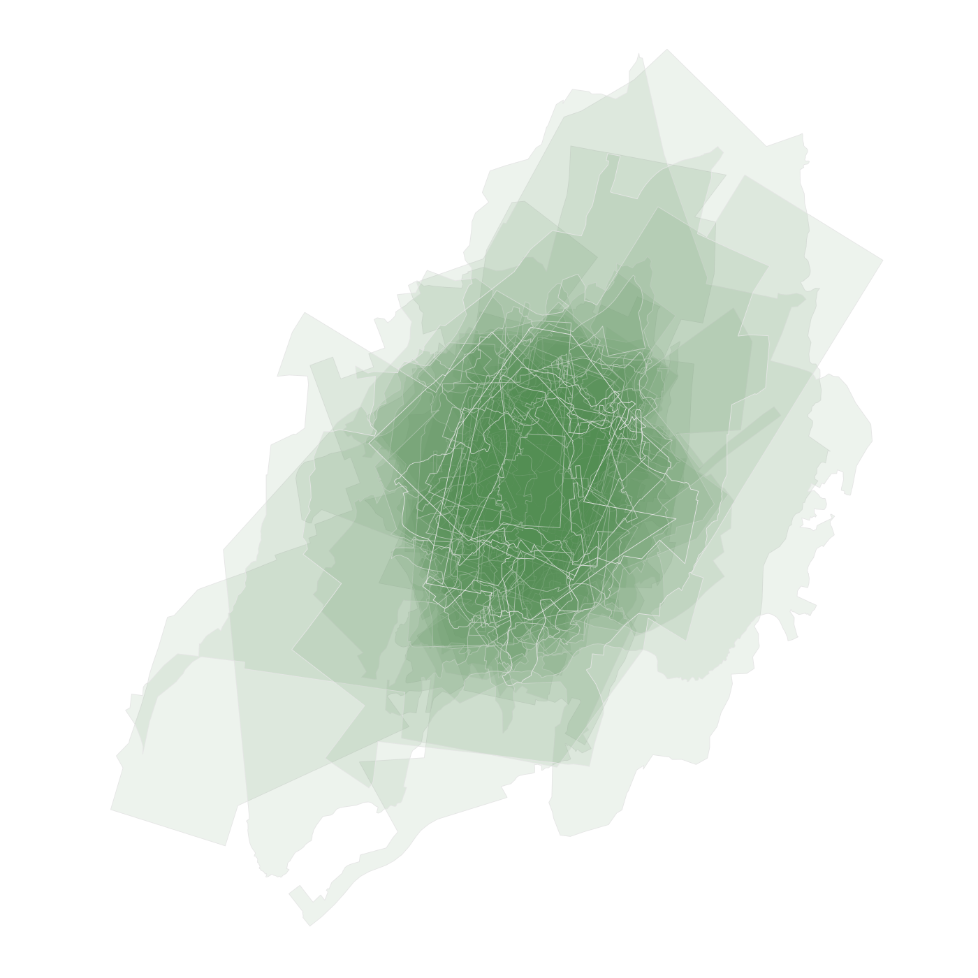
And just for fun, here’s a little glitch I ran into when first attempting the layout. The ‘burbs all ended up centred but superimposed, which I thought looked rather pretty in an abstract way given a bit of transparency: