Where the Voters Aren’t
You could be forgiven for thinking that all Wellingtonians are obsessed with politics. Advance voting started today, and already some voters are proudly sporting their “YES I have voted” stickers. Yet thousands of Wellingtonians have still not enrolled to vote. Who are these disenfranchised people, and why have they not enrolled?
Luckily, the Electoral Commission has data, broken down by electorate and 5-year age bands. The interactive charts there are pretty good, but I decided to download the data and put it together in different ways to explore it further. Here’s the enrolment patterns by age across the Wellington electorates (arranged approximately from the outer regions to the centre):
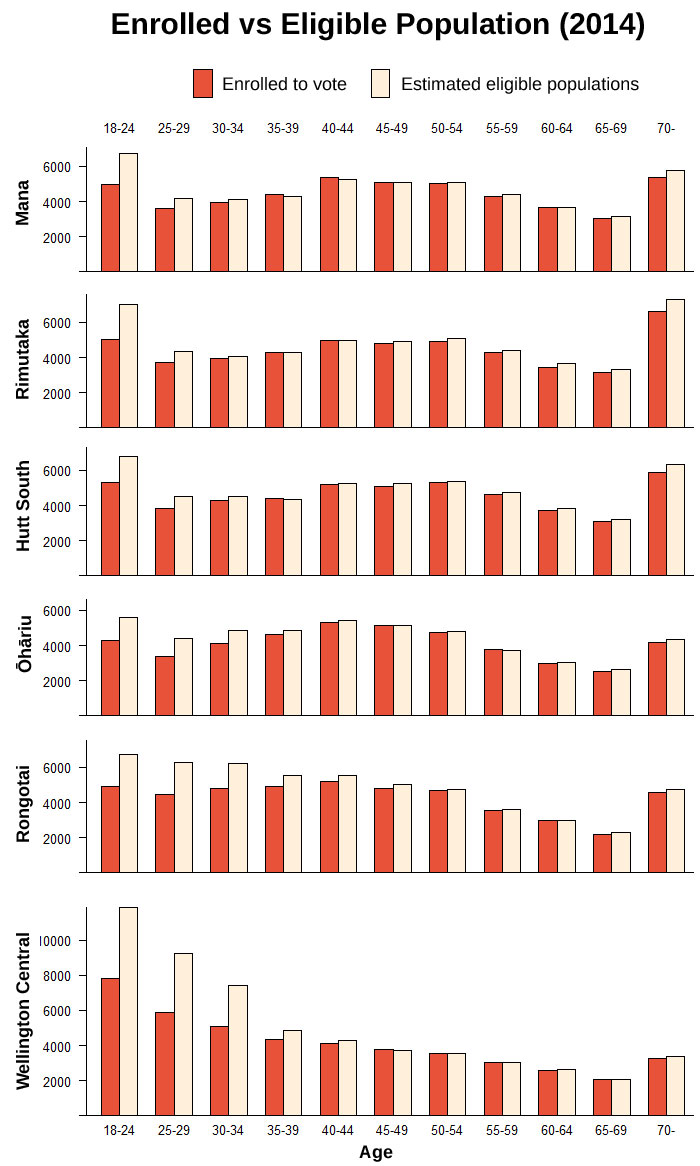
As has been widely noted, it’s the younger voters who are less likely to be enrolled. But the details of this pattern vary by electorate. In the outer electorates, by the age of 30 nearly everyone is enrolled; but when you get to Wellington Central, the lack of enrolment goes right up to 40. It’s not just the youth who haven’t got around to enrolling: in some cases there is notable disengagement among Gen X as well as Gen Y. Is this pattern common across the country?
I wanted to look at the national trends, but with a twist: I inverted the age axis so that it showed the approximate year in which each cohort turned 18 and was hence eligible to enrol. Was there a time when there was a distinct shift in enrolment patterns, or have people just gradually been becoming less interested? Let’s have a look.
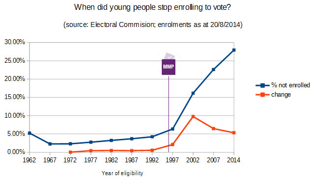 The pattern is striking: up until about the mid-90s, the proportion of non-enrolled people was very gradually increasing, but it stayed below 5%. From the mid-90s, the slope changes suddenly, and while the youngest people (18-24) are still the least likely to be on the roll, if anything the rate of increase has been easing off. I thought about what might have triggered this: Rogernomics? Student tuition fees? House prices? But one major, relevant event stood out; a fundamental change to the voting system, with the first MMP election in 1996.
This surprised, and to be honest, dismayed me. Surely a proportional system, which should be fairer and give people a greater say, would encourage enrolment rather than discourage it? But maybe all the quirks and apparent gaming of the system has put people off. Thresholds. Waka-jumping. Overhangs. Epsom. Winston.
I posted this to Twitter, and it generated a lot of discussion and some helpful objections. The data is a snapshot in time rather than longitudinal, so it could be that it’s about age rather than generation, and perhaps New Zealanders have always put off enrolling until they were older. People do go on and off the roll over time, so it may not just be about people “stopping enrolling” after some date. But that hypothesis is consistent with the overall decline in enrolment and turnout.
Other possible explanations included: the WWII and Boomer generations seeing voting as a hard-won right; a range of other worries affecting young people (student debt, uncertain careers); and a sense that the political and economic narrative is so dominated by older property-owners that it has become irrelevant to younger people. One of my other thoughts was that people who were first eligible to vote in 1996 would barely remember a time before Roger Douglas, and that since then both major parties had espoused various degrees of neoliberalism, removing the sense that there’s any chance to fundamentally change the economic system.
After that dismal thought, I went back to looking at geographic variations. Why do some electorates have a greater age variation than others? To make mapping easier, I used the overall age pattern to hone the complex pattern down to a single index: the difference between the percentage of over-35s enrolled and the percentage of 25-35 year-olds enrolled. I initially looked at 18-35 year-olds, but those maps were clearly dominated by students (e.g. the difference was massive in Ilam and Dunedin), and the mobility and other complexities of student life seemed to drown out other patterns. I made a map, with zoomed-in sections to make the cities more legible (click for a higher-resolution version):
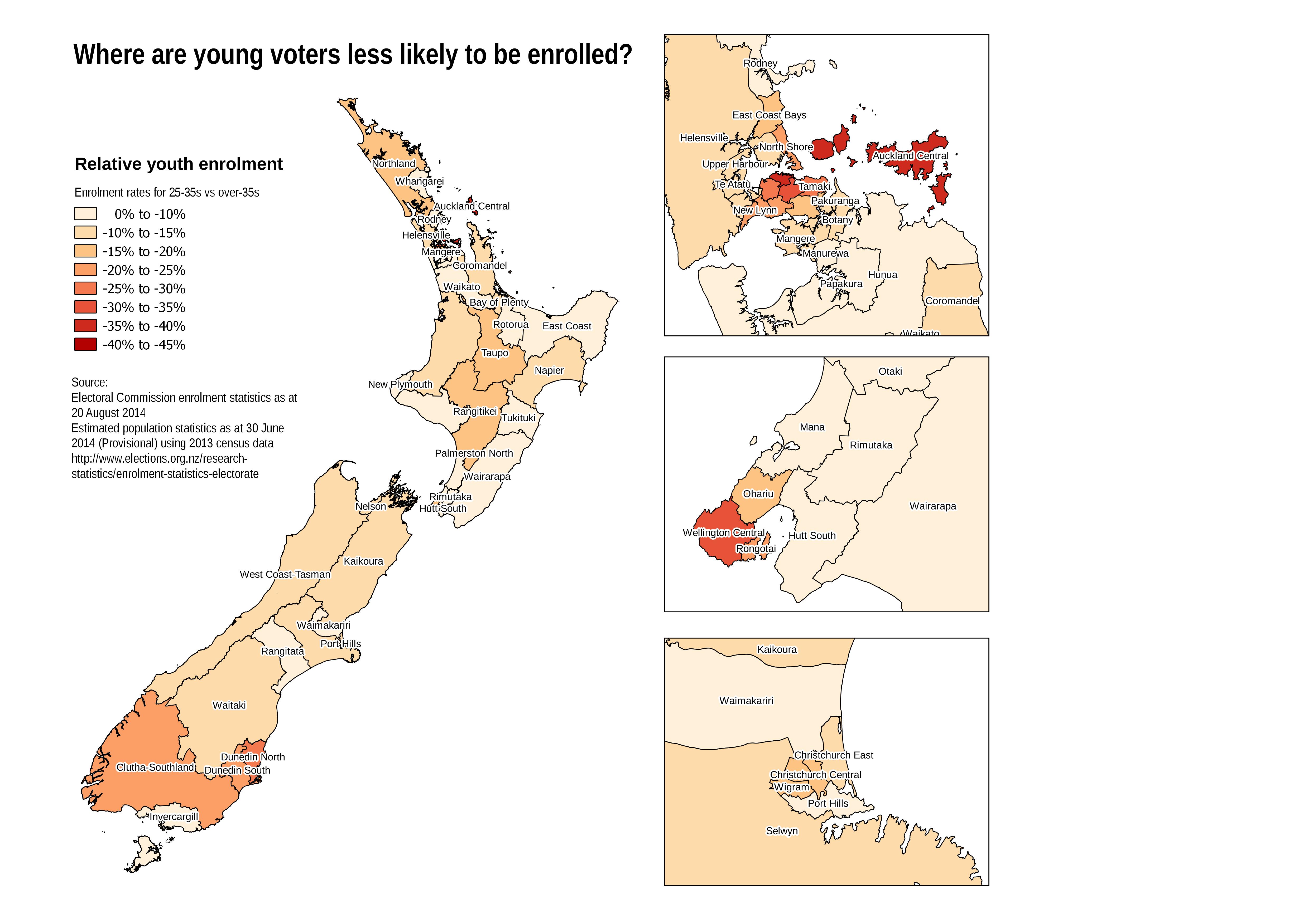 While there are some interesting variations between provinces, the aspect that most strikes me is that there’s a gradient from central cities to suburbs to rural areas. The more urban a place, the wider the enrolment gap between under- and over-35s. There’s a host of possible reasons for this: mobility, ethnic diversity, recent immigrants who are unsure of their eligibility, the distance from family and their voting traditions. There’s room for a lot more research on this.
One thing we can say for sure is that in the central cities, young people have given away their voice. They will spend more time in the future, but are having less say in it. People between 18 and 35 make up more than half of the eligible voters in Wellington Central, but only 41% of the current roll. If the nearly 10,000 eligible but unenrolled 18-35 year-olds in this electorate enrolled and voted, you could make a real difference to the way Wellington is represented in Parliament.
So, what are you waiting for? Enrol now.
[Data source: Electoral Commission enrolment statistics as at August 2014, with estimated population statistics as at 30 June 2014 (provisional) using 2013 census data. Charts and maps created with open-source tools: R, QGIS and LibreOffice.]
Fantastic post, Tom.
Love this line:
“One thing we can say for sure is that in the central cities, young people have given away their voice. They will spend more time in the future, but are having less say in it.”
I’ve known a number of people (myself included) who, at times, have stayed off the electoral roll to avoid providing debt collectors with an easy way to find me.
Very good point! Well, not so much about debt collectors, but I know people who are afraid of stalkers and the like finding their information on the roll. It’s much harder than it ought to be to take your details off the public roll, so for people who are afraid for their lives, enrolling to vote might not be worth it.