What Summer?
You’ve heard the complaints. You may even have uttered them yourself. “What happened to summer?” “Call this a summer!?” “Bloody Wellington summer.” And the half of official summer that Wellington’s had so far is definitely significantly less warm than usual. But is it really that unusual, and are we perhaps expecting too much from a Wellington summer?
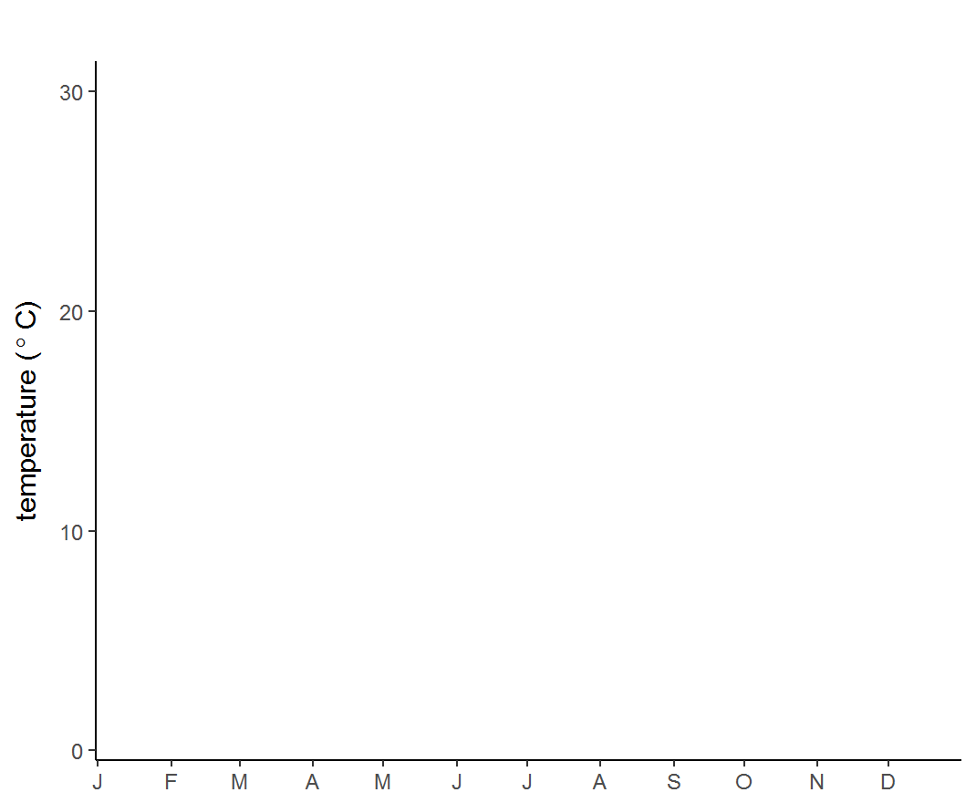
I decided to visually compare the temperatures for the 2016/17 summer so far against the previous 5 years of data. The chart below shows the temperature every hour at Wellington airport between August 2011 and the end of November 2016 as grey dots (they’re transparent, so they build up over the years to show the most common temperatures as darker regions). The orange curve shows smoothed average temperatures for 2011-2016, and the red dots show every hour of this summer so far, animated by day [technical notes are at the end of the post]. Click the animation for a larger version.
What does this show? It’s just possible to see that this summer is on average a bit cooler than the last 5 summers, particularly in early January, but the difference isn’t striking. We had a few days when temperatures plunged into single digits, which is uncommon for this time of year, but not unheard of. We’ve only had a couple of days that reached the mid 20s, and we had nothing like that scorching Christmas Day in 2012 when it nearly reached 30°C.
But I think what’s most noticeable is that the weather has been changeable…just as it is every summer, and pretty much all of the time in Wellington. We have a mid-latitude maritime climate, not a subtropical or a continental one, so we don’t get extreme differences between seasons, or long, reliable stretches of hot fine weather. The chart shows that the difference between one day and the next is often more than the difference between seasons. Temperature isn’t the only thing that indicates a fine day, and I’ll get around to looking at other aspects, but for now here are some detailed charts of Wellington climate that show that the seasonal difference in windiness, cloudiness and precipitation aren’t that massive either.
On that basis, some would argue that Wellington doesn’t get a proper summer at all. But what is “summer” anyway? I have a theory that we’ve come to expect (or even demand) several months of reliable barbeque weather, because our media and advertising are increasingly dominated by Auckland, Australia and Southern California, and we’re sold an impossible vision of “summer” as a three-month-long Coke ad featuring pretty people cavorting on beaches. For much of the world, summers either don’t exist as such (as in the tropics) or are as changeable as Wellington’s (in the mid-latitude westerly belts, particularly on western coasts) or are even less clement (in the high latitudes). If you say that Wellington doesn’t get a proper summer, you might as well argue that we don’t get a proper winter either since we don’t get snowed in for months at a time.
Summer in Wellington means longer days, more intense sunshine, and on average a bit more warmth and a bit less rain, cloud and wind. We still haven’t reached the normal peak of summer, which as the chart shows, is usually in February and early March, so we might get some barbeque weather yet. But you can never guarantee anything here, and as I suspect the next few days will show, we can get pretty much any sort of weather at any time of year. For some, that will be a constant source of disappointment, but some of us appreciate the meteorological dynamism. It keeps us alert, and watching the ever-changing skies. You can’t live here by chance.
Technical notes:
The hourly data for my chart comes from this archive of METARs, which only goes back as far as 2011 for Wellington at the moment. A longer dataset would enable comparison to a climatic norm, but with just five years we can get a sense of how this summer compares to recent memory. Temperatures are recorded to the nearest degree, but to spread them out on the chart I’ve added some jitter to the vertical dimension. Dates are in UTC (GMT), which will only matter if you’re pausing the GIF to look at individual days. The “average” temperature curve isn’t strictly an average, but is created by applying LOESS smoothing to the whole dataset.
Wellington airport isn’t that representative of many parts of the city and region: it’s windier, cooler, and lacks the extreme high and low temperatures you can get in sheltered valleys (e.g. Karori or Wainuiomata). However, there’s a lot of calibrated hourly data available for it, and it’s useful for showing whether there’s any difference between years.
The data was cleaned, transformed and plotted with the open-source statistical language R, mostly using the packages ggplot and gganimate.
Amazing data visualisation you’ve got yourself there, Tom.